
Shades of grey in fine art photography
To me, shades of grey in fine art photography do not signify an absence of colour. They allow us to view a subject, an outline or the passage of light in a different light. This selection brings together a number of Imaginary Planets in which grey features alongside other hues or monochrome tones. I invite you to explore these balances, which are at times subtle.
3 artworks
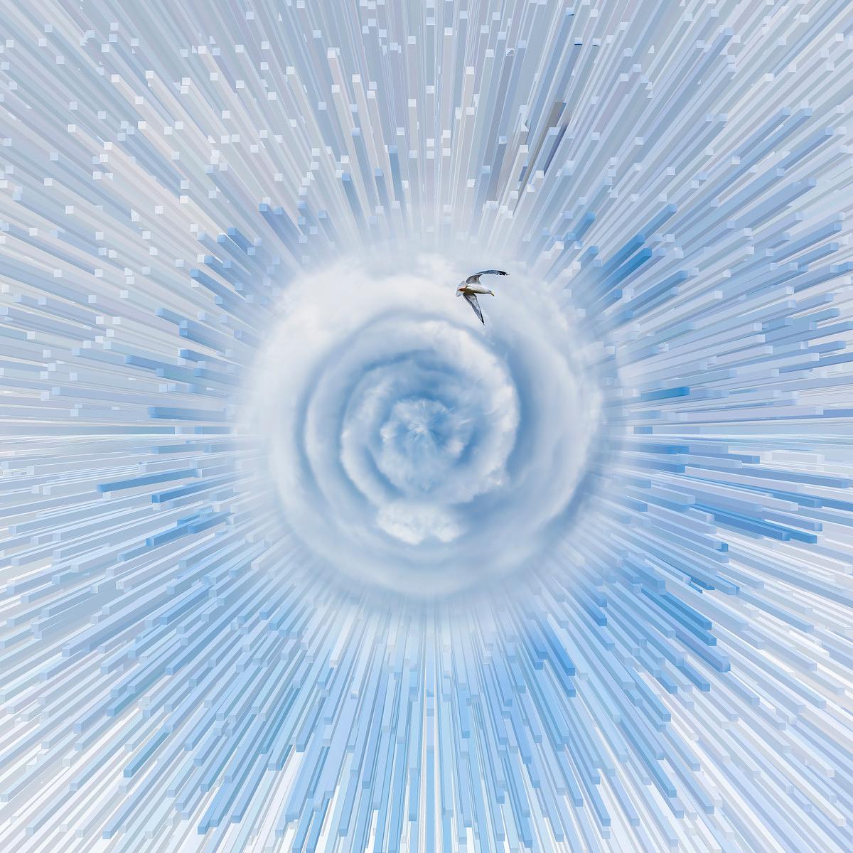
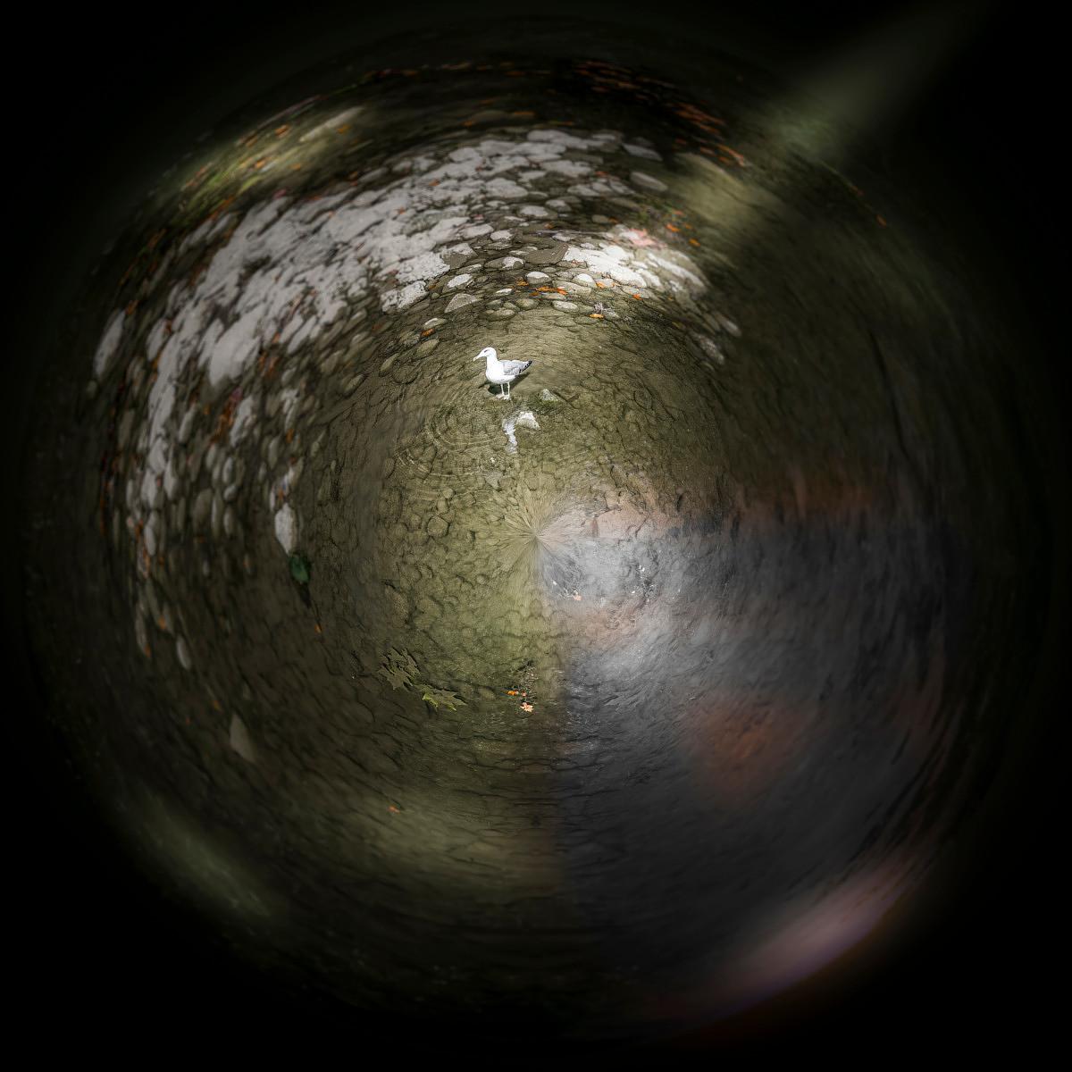
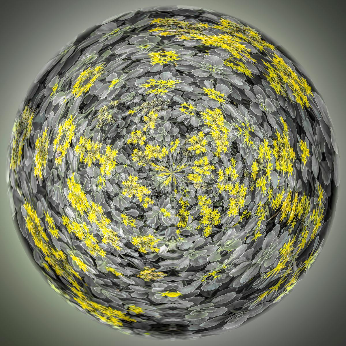
Grey: a transition between tones
Between light and dark areas, grey can create a transition. It complements forms and alters the way in which a neighbouring colour catches the eye. Rather than seeking an entirely grey image, observe the role these shades play in each photograph. A neutral surface can bring out a light or maintain a link between two areas of the composition.
Getting out of the Vortex depicts a seagull soaring above a celestial vortex. In Shards, flashes of yellow meet dark foliage. These two works remind us that the use of grey is not confined to black and white: a colour photograph can also give it an important role. The collection brings together instances of the hue, rather than necessarily monochrome images.
Nuance, contrast and the presence of the subject
To observe the greys, start with the edges of the subject and the areas where it stands out from the background. Are the transitions gradual or more abrupt? Does a shape seem to fade away or stand out more clearly? This focus on tonal values can sometimes alter one’s interpretation of a photograph that was initially approached through its most vivid colour. It opens up another way of exploring my work.
Linking this selection to other galleries
My practice as a Belgian photographer traverses landscape, flora and abstraction. The same works may therefore appear in several collections, depending on the subject or colour under scrutiny. Grey functions as a precise point of departure here. To continue, open the artwork pages or explore my artistic approach and how I transform reality into Imaginary Planets.