
The 2025 trend colours and fine art photography can engage in a dialogue without dictating which work to choose. This look back at the 2025 colour palette, notably ‘Mocha Mousse’, Pantone’s Colour of the Year, offers some points for consideration. My photographs remain, first and foremost, personal creations, to be chosen for the emotion they evoke.
Every year, enthusiasts of design, interior design and fine art photography eagerly await the reveal of the key colours for the coming months. In 2025, the prevailing colour palette is at once warm, natural and comforting, punctuated with bold accents. This balanced palette resonates with those seeking a harmonious, elegant and contemporary interior. It also provides rich inspiration for visual artists such as myself, the creator of the fine art photography series ‘Imaginary Planets’, where these on-trend colours form the heart of each composition.
Colour of the Year 2025: Mocha Mousse
The undisputed star colour of 2025 is undoubtedly Mocha Mousse, a soft, creamy brown selected as Colour of the Year by Pantone. This rich, enveloping shade evokes the warmth of wood, the depth of cocoa and a certain sense of serenity. It embodies a cosy spirit, the timeless reimagined with elegance. In my photographs, this velvety brown appears in earthy landscapes, natural scenes and even in the texture of a tree trunk or the evening light.
This colour blends easily into a natural colour palette, with possible combinations ranging from sand to beige, via taupe or warm grey. It is ideal for interior design to create cosy and elegant atmospheres.
A colour palette inspired by nature
In 2025, interior design trends continue their return to basics with mineral and organic hues. We see neutral colours such as clay, stone, linen and sage. These soft tones create a peaceful atmosphere and invite a sense of calm. They appeal for their timeless quality and their ability to adapt to all styles, from Scandinavian minimalism to bohemian or Mediterranean ambiences.
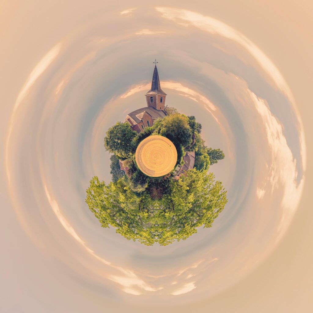
Which colour should you choose to create a natural atmosphere in your home? Alongside Mocha Mousse, consider pebble grey, sage green or golden sand. These shades are ideal for painting a wall, upholstering a sofa or selecting a rug for the living room. In my ‘Mini Planets’ series of photographs, these shades enhance 360° landscapes, evoking a sphere suspended in space — a miniature world where colour becomes a language.
Fine art photograph by Paul Marnef: The Village
Trending colours in 2025: a balance of softness and boldness
Whilst the trend colours for 2025 are predominantly soft and soothing, the new trends also have a few bolder surprises in store for us. Colourful accents such as cherry red, greyish turquoise, stormy blue and pale violet crocus will bring a burst of energy to interiors and wardrobes.
In my contemporary fine art photographs, these vivid colours are often used to catch the eye: a midnight-blue sky or lime-cream grass emerges as a chromatic nod. These accents lend personality to the image, just as they would in a well-designed living room. An armchair, a cushion or a photographic print in intense colours is enough to liven up an interior décor that is too subdued.
Neutral tones and comforting browns
Deep browns are everywhere: cinnamon, cocoa, dark chocolate and chestnut add depth to living spaces and help create cosy, even intimate atmospheres. This rise in popularity of browns is accompanied by a return to natural materials (unfinished wood, washed linen, looped wool), which feature in the interior design concepts of leading brands.
These on-trend colours are particularly prized for their cosy effect, especially in winter. In my winter or autumn ‘mini-planets’, this warm and reassuring tone takes centre stage, visually expressed through a palette of sepia, ochre and amber hues. These photographs work just as well as objects for contemplation as they do as wall decorations.

Art photograph by Paul Marnef: Sunflowers Galaxy
Pastels revisited: a soft and poetic interior design trend
On a lighter note, pastels have not had their final say. In 2025, they are evolving towards greater sophistication and subtlety. Shades such as butter yellow, lime cream (pastel green) and glacier blue are emerging. These hues are highly popular in spring interior design trends, particularly for children’s bedrooms and bathrooms.
They bring a welcome lightness, whilst allowing for bold combinations. For example, lime cream goes very well with chocolate brown to create a gentle contrast. In my pastel photographs, such as ‘A Little Astral Delicacy’, the soft colours serve to evoke the ephemeral nature and the poetry of life, within a harmonious spherical composition.
Which colour should you choose for the different rooms in the house?
In my ‘Imaginary Planets’ series, I visually explore a broad colour palette, ranging from the most delicate pastel shades to the deepest, most contrasting hues. Each work embodies a unique chromatic atmosphere – at times soft and ethereal, at others intense and dramatic – offering art lovers a true immersion in the trending colours of yesterday, today and tomorrow. These spherical universes are both miniature worlds and poetic mirrors of our emotions, where colour becomes a sensitive and universal language.
Here are a few suggestions for incorporating the trend colours of 2025 into different living spaces:
• Living room: Mocha Mousse, cinnamon, sand, touches of cherry red.
• Kitchen: sage, stone, greyish blue.
• Bedroom: lime cream, crocus, rosy beige, light chocolate.
• Bathroom: glacier blue, butter yellow, off-white.
• Study: plum, dark brown, greyish turquoise
These décor ideas are suggested by numerous interior designers, who focus on striking a balance between the timeless and the trendy. Finding the right balance of each shade is essential to avoid overloading the space whilst still personalising it. For my part, I invite you to incorporate photographic art into your décor, with fine-art prints of mini planets that subtly complement your colour scheme.
Take a look at my page dedicated to interior design, featuring photographs of art displayed in home interiors.

Art photograph from my ‘Imaginary Planets’ collection: Illuminated
The role of designers in colour trends
Every season, trend agencies, stylists and designers influence the choice of on-trend colours. Their work involves analysing societal changes, consumer preferences and innovations in materials. In 2025, the need for comfort, nature and sustainability is reflected in reassuring shades and understated palettes, accented with a few touches of whimsy.
Collections of furniture, paintings and textiles follow these broad trends, which can be found in both department stores and more niche interior design boutiques. Consumers are paying ever greater attention to the harmony of their interiors and their ability to promote well-being and emotional balance. Trendy colours therefore play a fundamental role in the design of our living spaces… and in the choice of a photographic artwork to display at home.
In summary: the trend colours for 2025
The year 2025 is characterised by visual comfort, a natural colour palette and a fresh take on the timeless. Whether through the colour of the year – Mocha Mousse – elegant browns or reinvented pastels, each shade contributes to a soothing, personalised and environmentally friendly interior design trend.
Are you wondering which colour to choose for your next renovation or to complement your interior décor with a work of art? Draw inspiration from the latest trends, try out simple décor ideas such as repainting a section of wall, changing a few accessories or investing in a miniature photographic world in the form of a fine art print.
More than ever, 2025 looks set to be a year in which colour serves to promote comfort, harmony, personal expression… and artistic contemplation.
This page offers a glimpse into the trends of 2025. Key reference: Mocha Mousse, Pantone Colour of the Year 2025. To continue reading, discover my take on Cloud Dancer and fine art photography in 2026.
Explore interior display simulations · Discuss a work of art