
Comparing similar art photographs helps you understand what appeals to you: a colour palette, a circular composition, a light effect or a motif. In my Imaginary Planets series, however, two similar works can tell different stories. Here is a method to refine your selection, without reducing your choice to mere similarity.
Start by identifying what appeals to you
Before comparing media and dimensions, observe your first reaction. Is it a dominant colour, a recognisable landscape, a very minimalist composition or a sense of movement? Note down two or three criteria. These will help you compare the works without letting a list of characteristics replace your own sensibility.
Compare the colour palette and composition
Two blue images do not necessarily evoke the same emotion. A light sky, a deep sea and stark architecture make very different uses of the same colour. Next, look at the position of the motif within the circle, the negative spaces and the direction of the lines. To begin this exploration, you may wish to view my selection of mini-planets by colour.
Distinguishing between visual resemblance and the history of the work
A beach, a tree or a town may feature in several photographs. Yet the light, the viewpoint and the transformation give each one its own identity. Open the details of the selected works and read their descriptions: recognising a place or discovering a story may change your preference. The examples illustrated here serve to highlight these differences, rather than to identify a ‘better’ work.
Whittling down one’s selection to a handful of images
I recommend selecting three to five works and revisiting them after a short while. Compare them under similar viewing conditions, then imagine the place they will occupy in your daily life. When selecting a collection, look for a common thread: a shared colour palette, an alternation between stillness and movement, or the same motif reinterpreted. Consistency does not require all the images to look alike.
Next, consider the format and finish.
Once you have clarified your preference, please check the dimensions and finishes available on each product page. The choice of paper or a mounted presentation affects the overall appearance of the print; a screen cannot convey everything. My guidelines on the size of an art photograph depending on the room complement this step, without replacing the experience of encountering the image itself.
Request an artist’s perspective on your selection
Please let me know which titles you like and which ones you’re unsure about. I can explain their background and the differences in the proposed presentations. The aim is to help you choose your artwork, whilst preserving the delight of that first glance.
Some Imaginary Planets to discover
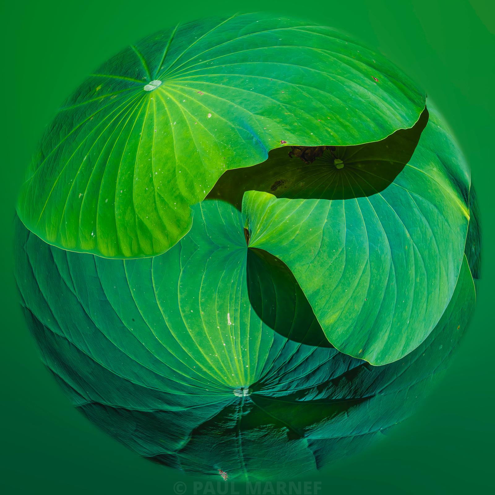
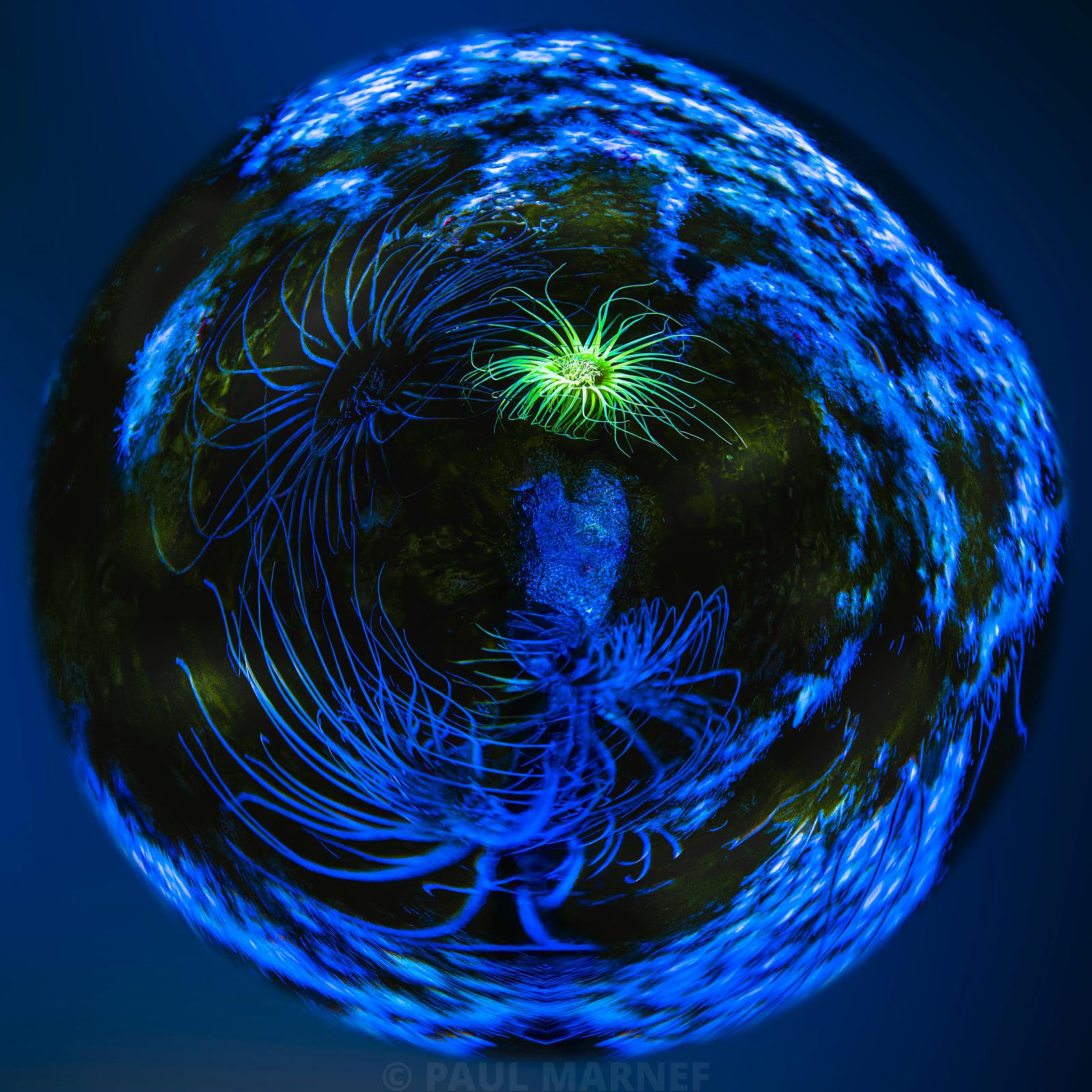
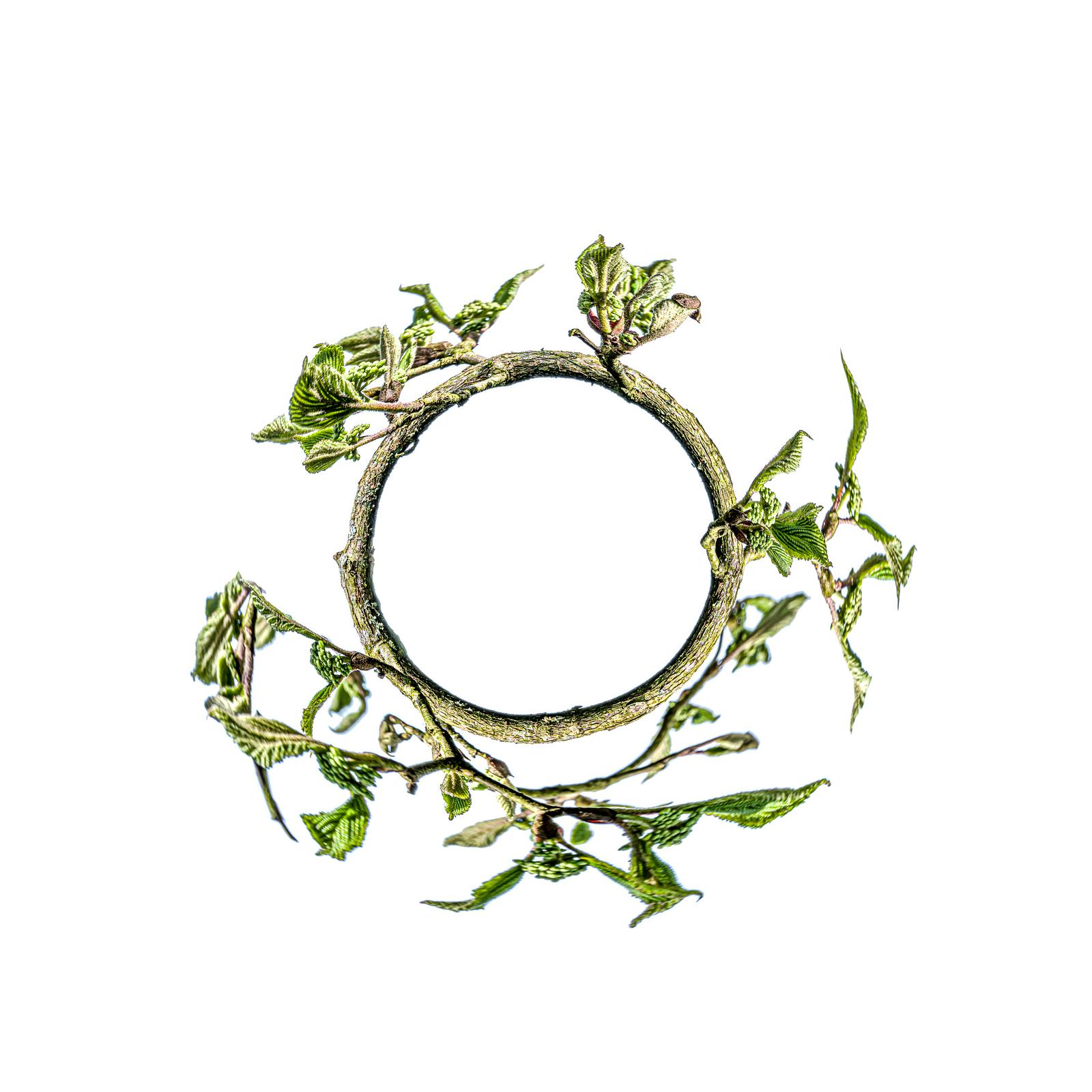
To continue your exploration
Would you like to find out more about a work or how it is presented? Please write to me to discuss it. You can also explore other topics on the fine art photography blog.
See also: Decorating by colour: exploring my mini-planets from blue to yellow; How to choose the right fine art photograph?.