
Find a colour palette that suits you
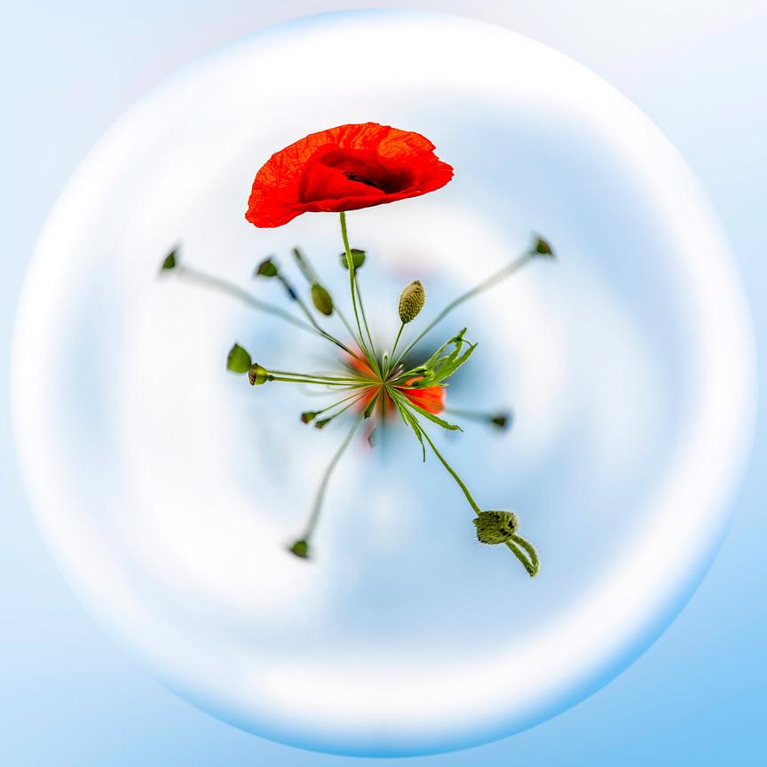
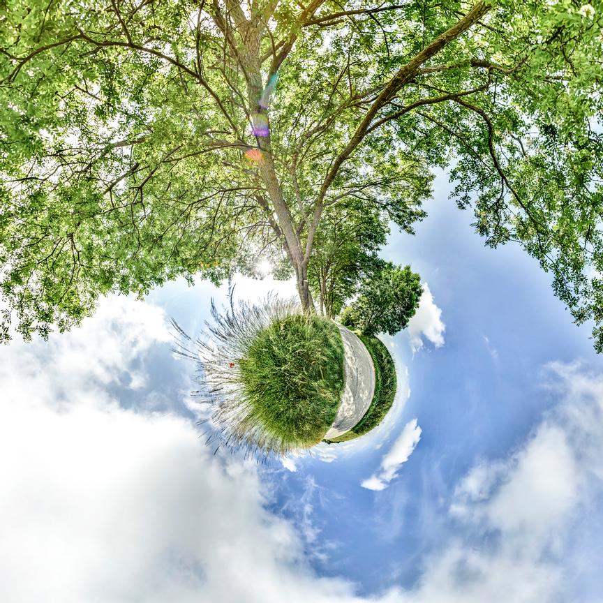
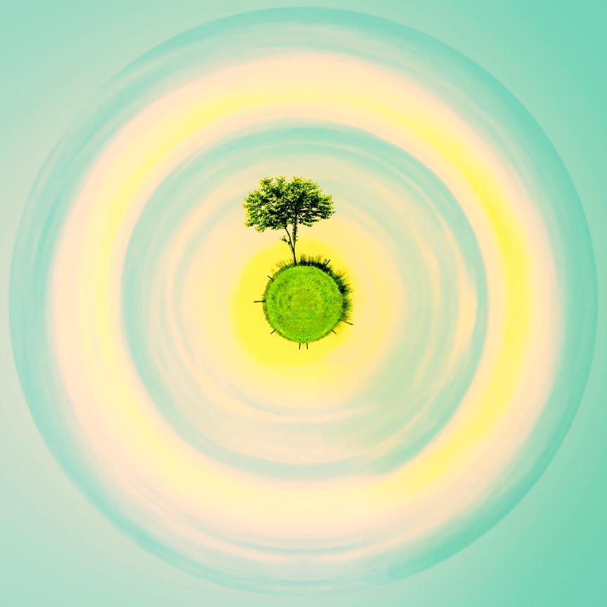
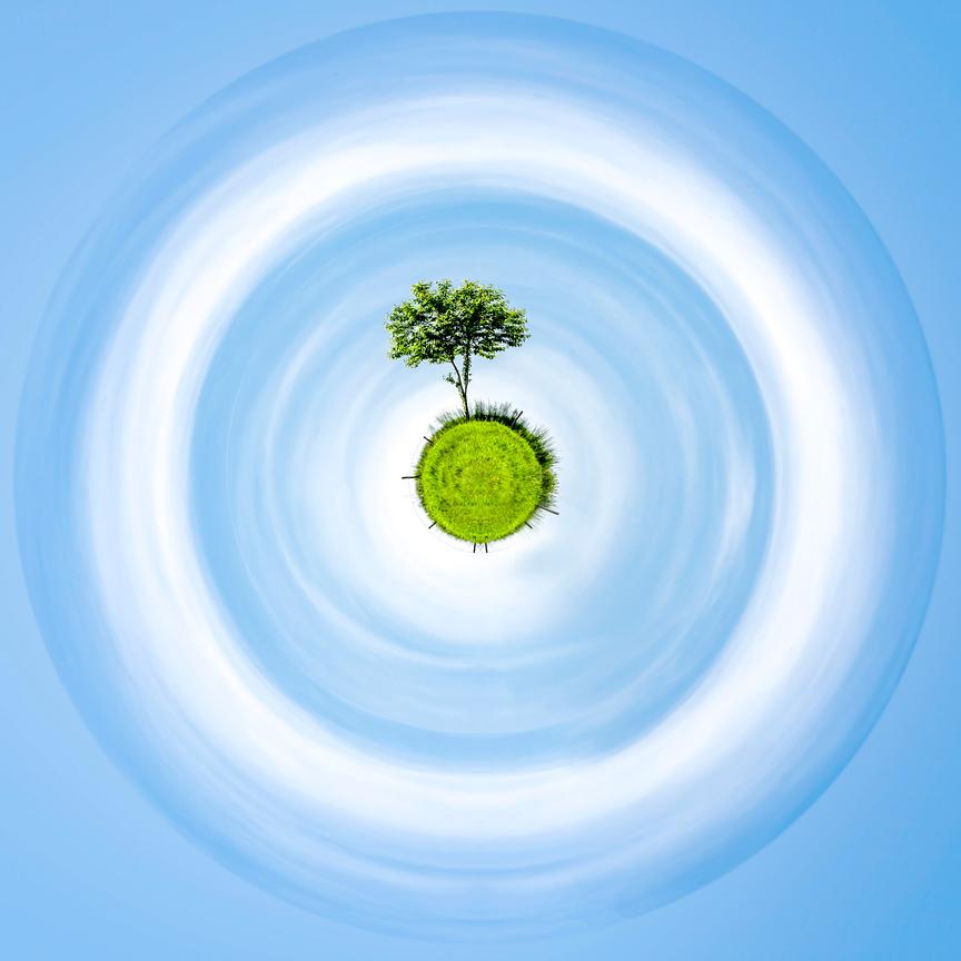
A colour can be the starting point for an encounter with a work of art. In this selection of mini planets organised by colour, I invite you to explore the blues, greens, pinks, reds and yellows of my Imaginary Planets. The aim is to discover a palette that speaks to you, before considering the format and how the pieces will be displayed.
Start with the colour that appeals to you, then see how it features in the composition. A very prominent blue can envelop the motif; a more subtle blue might simply open up a sky. Choosing a colour scheme does not mean that every element of your interior has to match.
The colour shown on screen is for guidance only. The paper, whether glossy or matt, and the lighting at the exhibition venue will affect how the colour is perceived. For details of the finishes, please refer to the artwork’s description and ask me for clarification if you are unsure.
Whether in a professional setting or at home, I prefer to start with how the artwork makes you feel. A colour can resonate with the space or create a deliberate contrast. I do not automatically attribute an effect on concentration or well-being to it: every perspective and every context is different.
Green can invite you to explore plants or landscapes; red and pink offer different intensities. Also look at the lines, the negative space and the role of light: these are just as important as the dominant colour. The links at the end of the selection allow you to continue this exploration.
The images below present several versions of my Imaginary Planets. Please check the formats and edition details on each product page before placing an order. Some works also offer an augmented reality experience; please confirm whether this is available for the image you have chosen.
You can enhance the atmosphere of your home or workspace, thereby strengthening your brand image amongst your staff, partners and clients. You can choose from the ‘mini planets’ artworks I offer to find the piece that best suits your business.
My online gallery holds a rich selection of images waiting to be discovered. I invite you to explore the collection to find a photograph that resonates with your space. If you are seeking a particular image, please feel free to contact me; I am here to help you find the one that feels right for you.
Alongside my work for interiors and corporate clients, I remain mindful of my environmental impact, collaborating with eco-friendly suppliers and laboratories.
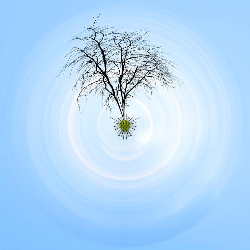
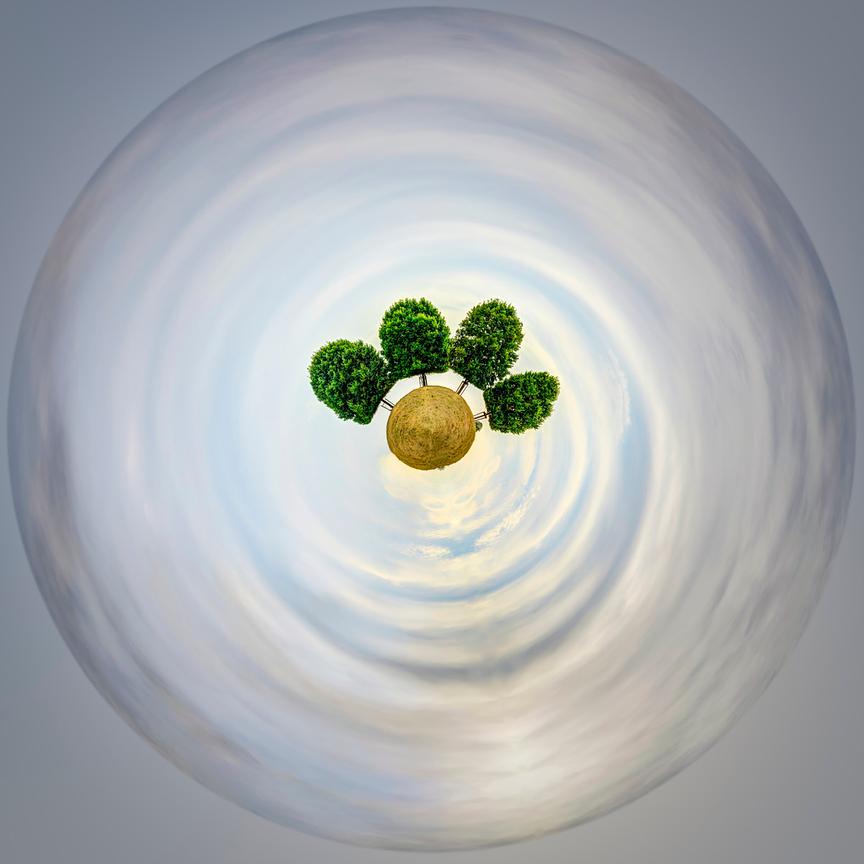
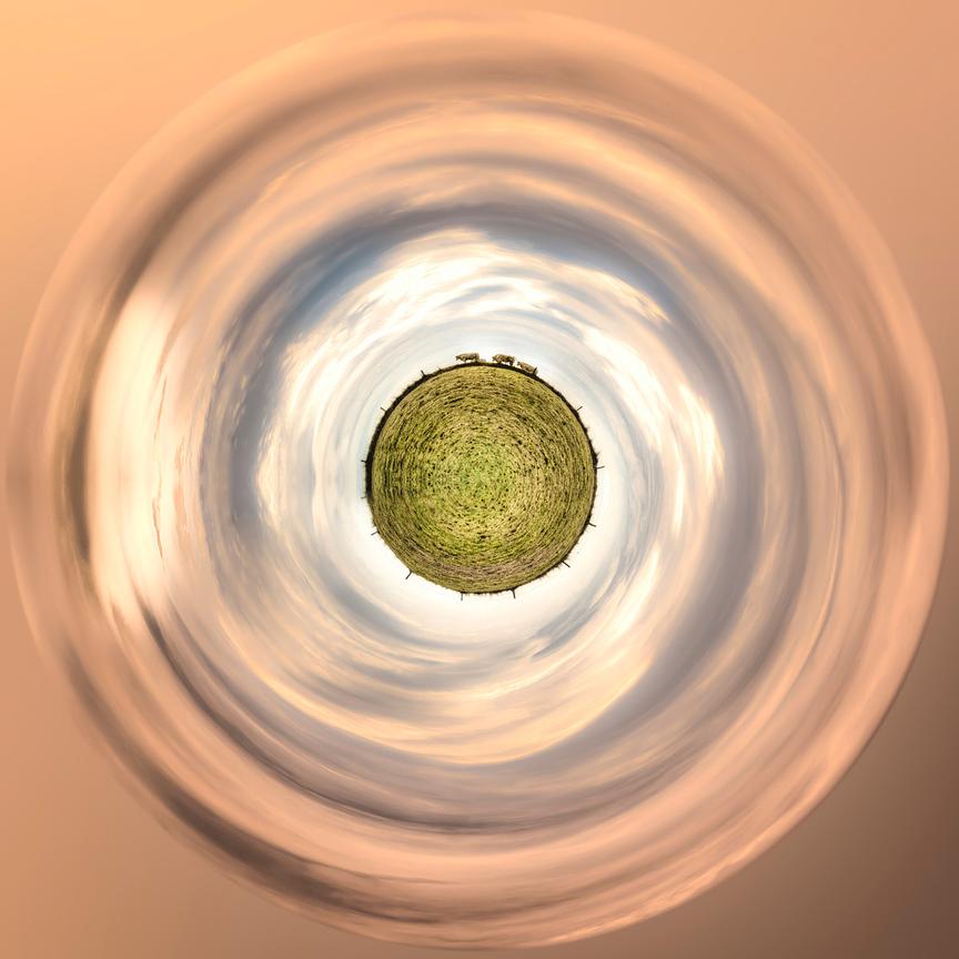

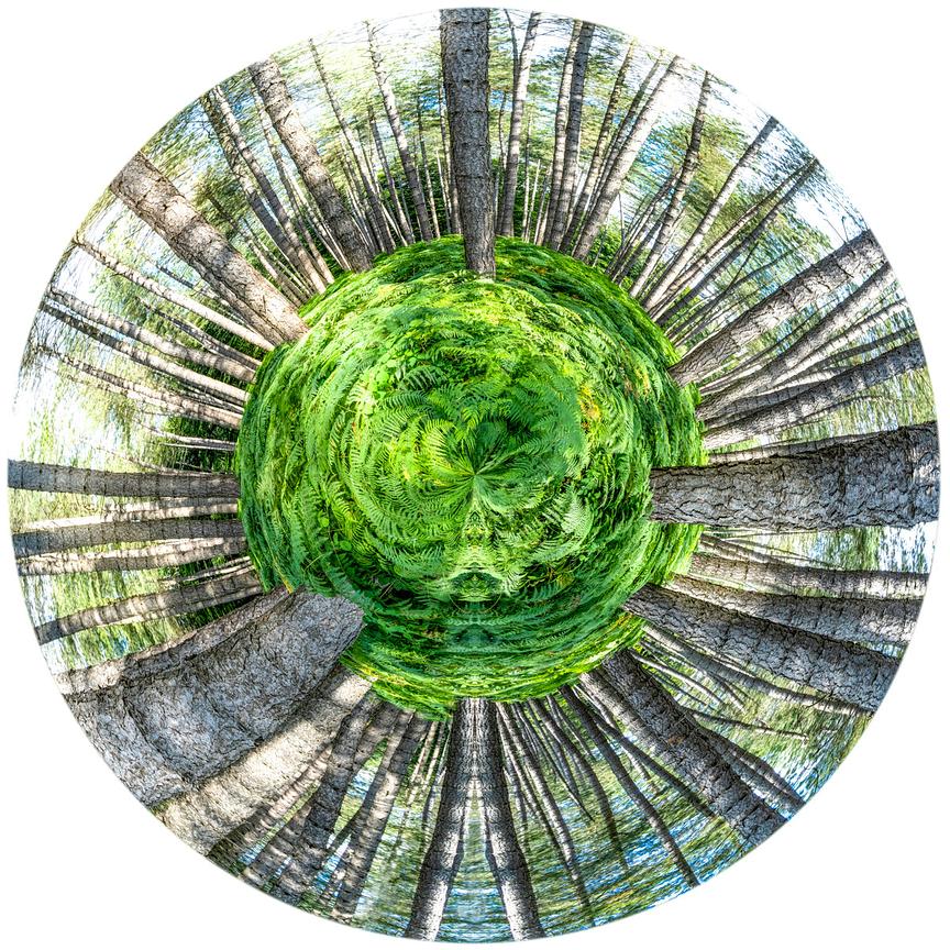
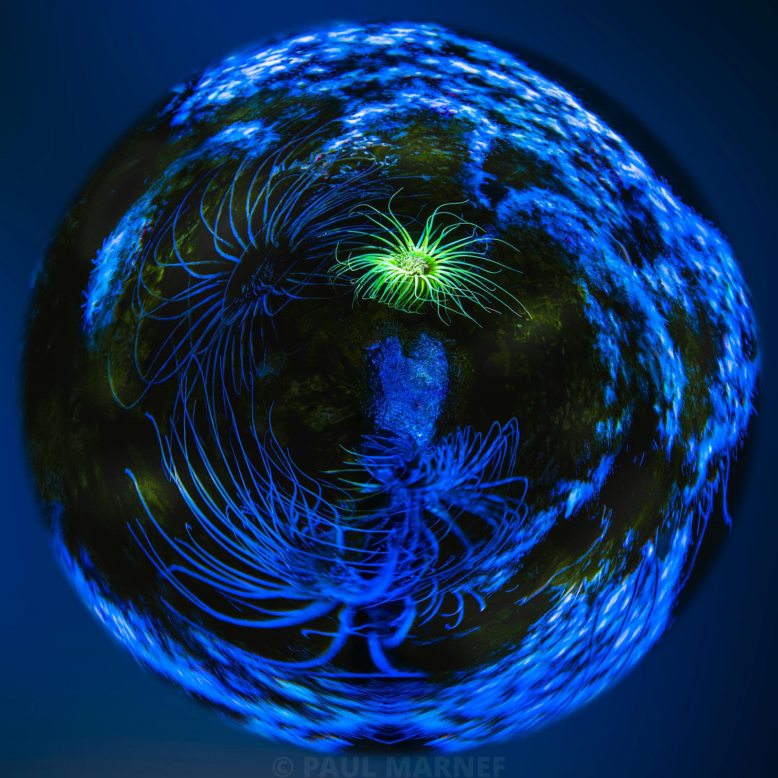
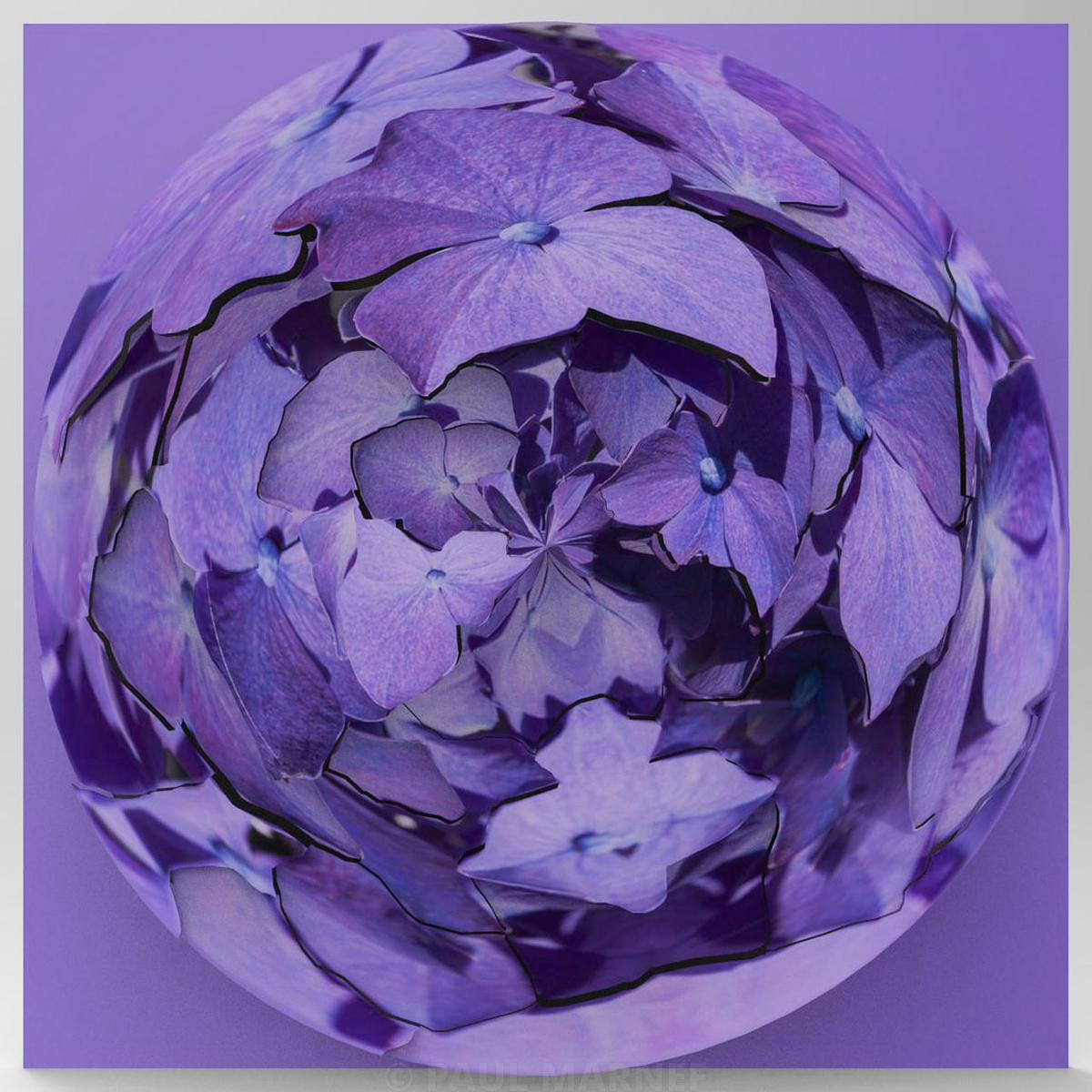
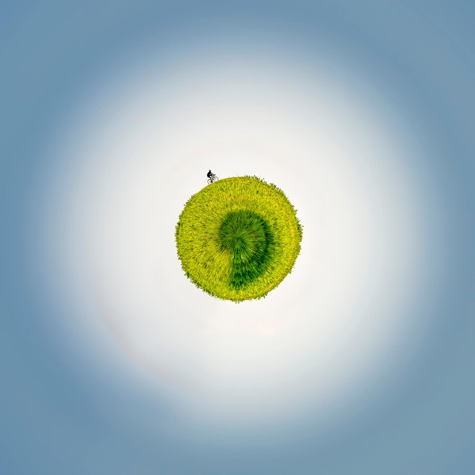
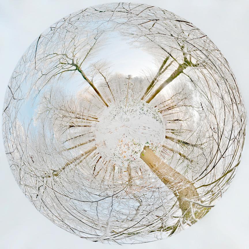

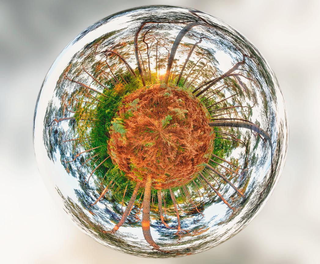

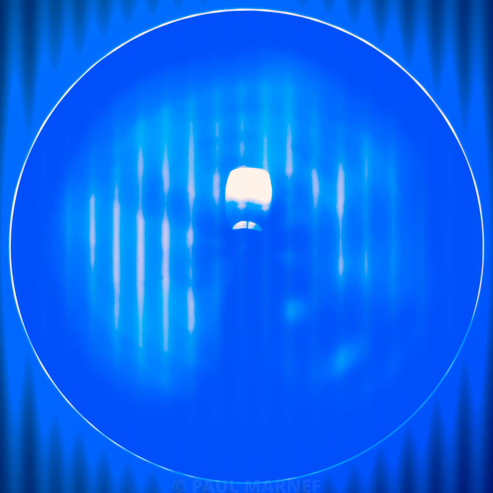
Explore the mini-planets by colour
A photographic work can transform the atmosphere of a living room, an office, a hallway or a professional space. Discover the Imaginary Planets by colour, format or mood. You can also explore the photographs featuring black, to examine the role of contrasts in monochrome or colourful compositions.
To contact the visual artist and photographer Paul MARNEF:
Website: www.paulmarnef360.com
Instagram: www.instagram.com/paulmarnef360
Facebook: www.facebook.com/PaulMarnef360
Email: p.marnef@isoway.eu
To continue your exploration
Would you like to find out more about a work or how it is presented? Please write to me to discuss it. You can also explore other topics on the fine art photography blog.
See also: What size should you choose for a fine art photograph? A room-by-room guide (living room, hallway, study) – square, round and small framed formats; Interior design ideas featuring fine art photographs: my tips and inspiration.